A little back story
When Hayden was about 2, we got a little wooden playhouse from my boss. It was his daughters, but now that she was older, they no longer wanted it and gave it to us.
It's a cute little house and at our other house, we had built a little stone pathway up to it. We never painted it because I liked the rustic wood look.
When we moved to our current house, the playhouse came with us.
It has sat in the yard for the past 4 years, pretty much untouched and not played with. Perhaps I never really paid it much attention because I was just waiting for a little girl to want to make it home.
I now that that little girl and I feel she is the perfect age for it. With that being said, I have also decided that it's time to paint it and I need help picking out colour combos.
Here it is as it currently stands in the yard:
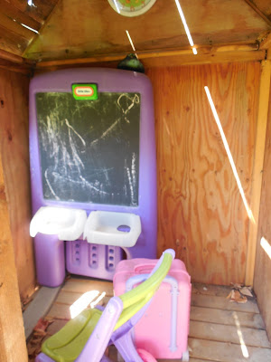
The inside is not very big...probably big enough for a little table and chair. Perhaps a baby bed.
This is the picture I first saw that inspired me and was my colour combo of choice until Abby said she didn't like it:
Here are the samples we picked (sorry, the quality is not very clear)
This first one is pretty much the colours in the inspiration, the pink, sage-like green and yellow. I would keep it the same....most of the house yellow, pink posts and trim and green roof.
This one is a bit more bold....orange, blue and red. I would paint the house blue, trim red and roof orange.
Now, the colour is WAY off on this one, but from left to right, lime green, plum purple and turquoise. I would paint the house green, the trim purple and the roof turquoise.
So, yesterday Abby wanted it blue and orange...today she likes the pink and yellow. So, basically, I can't leave it up to the 3 year old My heart is pulling towards the girly palette....what do you think? Would you do something totally different from what is here?


I would go with the first theme....IT is soft, and girly. :)
ReplyDeleteI'm not a fan of the dainty girly colors. The pastels to me just look faded, and with the sun might fade more. My choice would be the bolder second set, except I would trade in the orange for purple!
ReplyDeleteBut I'm sure whatever you pick will turn out awesome!! :) :)